Wednesday, September 26, 2007

out with the old, in with the new

Wow, such lovely responses already to my last post! I'm so glad people liked it! I feel this sort of design is more in the direction that I'd like to be heading.

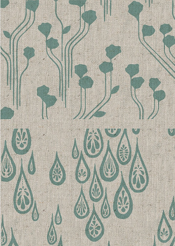
But on that note, if I'm going to be printing even more new designs, I have to start relinquishing some of my old screens. I've got quite a collection gathering at the printers, and they've asked for some back. Bonsai Forest & Wild Geese, Poppies & Raindrops are the two screens I'm thinking of giving up.

So... the question is, should I do one last run of those old designs before discarding the screens? I thought the linen might help revitalize some of them, such as below:

one last go?

Honestly now. I can accept when it's time to move on ;)

experiment

mmmm, everything looks nice when mocked up on linen....

rectangles

Tuesday, September 25, 2007

A trip to the fabric printer

Today I went for a walk to the fabric printer to check out some colour samples they'd prepared for me. And I did something I've been meaning to do for ages - I took my camera with me!

I think it's true that if you're buying something handmade, it becomes so much more valuable when you feel connected to the process. It's the background if the product that's interesting - how it came to be. I reckon that's why almost all of my customers have found me through my blog. Because you're not just buying something by a nameless, faceless company, you're buying from someone you know, who you've listened to rambling about stuff day in day out.


The printer's building, formerly "The Mighty Apollo Gym" ! They're on the top floor. If the building looks familiar at all it's because it was used in the filming of the TV series "Last Man Standing". The main character supposedly had his funky warehouse apartment in this building, hehehe.


When I arrived, Nadia still had the mixing dishes out, containing the 4 colour samples I requested. This is for a dusty "robins egg" colourway. (The design in the background isn't mine).


Here's one of my screens, standing up against one of their printing tables (note big long tables in background). This screen has the birch forest and riverside adventures designs on it.


Choosing colours for the "teal" colourway. The ones on the fabric are a little too blue, so we're trying for something a bit greener.


The final samples for the robins egg colourway. I totally love that one in the foreground. However it's actually supposed to be the birch/riverside designs in this colour, and on a slightly lighter basecloth. Still, yummy. I might print this combination next time :)


Not a great photo, but when I got there they'd already printed the riverstones + flowing dots designs in the raspberry, on the cream coloured linen (it needs to be heat set first, before I can take it home). Looks really nice in person, not so much in the photo :)

And that's it! I'd love to take some photos of them actually printing but we'll see about that. They didn't seem too keen on the idea, not sure why.

Woe is clumsy me :(


Baaaawh!!! My most favouritest piece of crockery ever! Morning tea will never be the same again :( :(

Luckily I know this lady who is about to send me this mug.... but it's just not the same, ya know? I remember the gorgeous shop I bought it from - cutest shop ever, full of 'shrooms and all sorts of japanesey goodness, with a tiny little cafe on the mezzanine level... sigh.

On the upside, printer just called and has some print sample swatches for me to look at! So I'll go distract myself by looking at those :) Hope the linen looks good!!

Sunday, September 23, 2007

Kirin&Co's Tutorial Factory - Tissue box cover

Well, the suggestion of a tissue box cover tutorial definitely generated enough interest, so here it is! I hope it all makes sense and turns out correctly - if you have any troubles or feel the tute needs amending, please let me know!

The tissue box cover is essentially a single flat shape which folds up the sides of your tissue box, and is fastened at the top. This shape can be made in two different ways:

a) From a single piece of outside fabric, plus a single piece of lining.

b) From a number of pieces of outside fabric, sewn together in such a way that the pattern is always upright on all four sides of the box. Plus a single piece of lining.

These two options (and the direction of the fabric) are illustrated below:


Either method is fine - it depends on the fabric you're using and whether or not it has an obvious "right way up".

1) To create the above shape, we firstly need to figure out it's dimensions. Measure the size of your desired tissue box, taking note of the following lengths: W, H, L, X & Y:

Based on the above, this is how your cover measures up:


Don't forget to add 6mm all around for seam allowance!

2) Cut out this shape from your cover fabric using either method a) or method b). Cut out the lining fabric to match.

3) Pin the cover and lining fabrics together right sides facing. Cut two pieces of elastic each about 8cm long, and create two loops. Pin the loops in place between the fabrics, as shown:

4) Sew around the outside of the entire shape, 6mm in from the edge, leaving a gap at the end of one of the side flaps as shown above. You may like to run the machine back and forth over the elastic loops to make them extra secure.

5) Turn the piece inside out and iron flat, then hand stitch the hole closed. (Note: You may wish to test the cover on your box first, to make sure it fits nicely. If any of the flaps are too long you can always turn it back inside out and shorten them).

6) Now just position two buttons as shown below (the elastic loops should be nice and tight), and you're done!

Thank you to Heather for making the original tissue box cover from which this tute was developed!

Journal cover - Japanese style

Weird. Last night I had my second bout of late night stitching in a row. Not sure what's going on there, but I am sure it's not how most "young people" would spend their weekend evenings. But ahh, who cares :)

Anyway, you know how it gets to 10:00pm, and you're sitting on the couch not quite ready for bed but with a sewing project in mind? And you say to yourself "Oh, I'll just cut out the fabric and then go to bed". And you cut out the fabric and then think "oh... I'll just pin it together". And then afterwards you think "oh, I'll just do the first round of stitching", after which you figure that you may as well just finish it off.

Well that's what happened to me last night. I decided to make a journal cover based on a pattern I saw in a couple of Japanese craft books:


It's really quite a simple design, and it seems like almost all Japanese fabric book covers are made this way, but I've never seen it here before:


It wasn't till after I'd made it that I realised how useful that little tuck under flap is. I thought it was just to make it easy to get the cover on, but I found it also helps to keep the cover from buckling when you have the book open flat. You can take up the slack by pulling the flap in tighter. Very neat.


The pattern isn't particularly complicated, but you can find it in either of those books above, which you can find in one of the online Japanese crafty shops that I've listed in previous posts (sorry can't remember which - but I know I've seen them!). Otherwise the pictures above should make good reference. It's just one big rectangle: tapered at one end, folded over and sewn at the other, with the vertical band sewn in also. Measurements should be based on your own journal and common sense :)

One last note - how bloody cute is that fabric!! I'm kicking myself for not buying more. But that's what happens when you're over there - it's all so overwhelming, and when you see something you like you sometimes hold out because you figure you'll find something even better later on. But my tip - don't hold out - just buy buy buy! I found it in Kyoto (again just $1 for a fat quarter) from a shop called Nomura Tailor in Teramachi Arcade. Grr.

Saturday, September 22, 2007

Little pencil case

Petey said to me last night: "why don't you make meee anything?" So I asked what he wanted and he said he'd like a little slimline pencil case. I just happened to have a single, suitable zipper in my stash, and some very appropriate fabric (only $1 for a fat quarter in Kyoto - can you believe it??) and put it together late last night and this morn. I just went and presented it to him then but...well he was still asleep and just rolled over.


(don't you just love arranging/styling up little product shots, just for the sake of it?)

I haven't made anything with a zip in it for ages, and I can't say I enjoy it! At least this time I tacked the fabric to the zipper band first before machine sewing. I used Amy Karol's 'zip pouch' pattern as a reference, but I modified it because it didn't seem quite right to me. Her instructions say to sew up the sides and bottom of the outside fabric, then sew on the zip, then sew up the sides and bottom of the lining fabric and just hand stitch it into the inside. Hmm. I don't like hand stitching and especially not in such a prominant place where u can see the crappy job i've done :)


(more product shot experimentation - man I wish I had a fancy pants camera)

I opted for sewing the outside and lining fabrics to the zipper at the same time, and then sewing down the sides and bottom (leaving a hole in the bottom of the lining for turning inside out). Anyway it seems like there are heaps of different ways to do this, and each has their pros and cons, and there's no simple, perfect way.

Brekky time...

Wednesday, September 19, 2007

quick pics

Ooch a busy work week this one! But thought I'd quickly pop onto the blog and post some piccies:


Tissue box holder made by Pete's lovely mum. She took some progress shots whilst making it so I'll upload them somewhere soon if anyone's interested in a tute?


You know, I really have no idea why tissue boxes are always so ugly. I mean really, it's like they put no thought/effort at all into the design. Does anyone really like white roses, seashells or dolphins? There was once this really lovely design with silhouetted japanese branches all around the sides. Now that was nice. But then it disappeared!! Anyway this is a great solution - thanks Heather!


And of course... the crafty book spine shot. That's what you do when you buy a bunch of crafty/sewing books right? ;) Anyway they're both lovely. Amys' book covers a lot of great basics, but Lotta's takes the cake when it comes to styling and fabric selection. I'm a sucker for that muted Japanesey-craft-book style photography.

Sunday, September 16, 2007

development, thoughts and a newbee

Well, the perfect linen has been found! (thanks to Kristen). It's actually a cotton/linen blend, and a little more expensive than the others I looked at, but well worth it I reckon. Most of the other linen blends I looked at had a very manufactured feel about them. It felt like the colour was achieved by bleaching and dying, rather than letting the natural colour of linen and all it's subtle variations show through. So I'm happy with my final choice and I reckon my customers will be too. And after calculating it all out, my increase in cost is fairly minimal, so I won't have to bump the price up by much - phew!

Wholesale orders sorted, fabric order placed, colours chosen, now we just play the waiting game. If you want some hand printed lovelyness in the meantime, look no further than Hollabee's etsy shop, who has just released her own new fabric! We're multiplying, it seems :)

I must confess something. I had a revelation the other night, whilst at a dinner party flicking thru a friend's new copy of Lotta's Simple Sewing (my copy is in the mail - yay). I was looking at all the lovely photography of her textile designs in context, and was really struck by how much
that was what I wanted to be producing. That feel, those sorts of designs, that level of simplicity, that texture. And it really struck me how much what I have done so far isn't really in that direction at all. Not that what I've done is bad or anything, just not really where I want to be. It resonates with one answer I received to my questionnaire that's been stuck in my head: "some of us are minimalists, you know".

So yeah, I really want to start taking things in that direction. I think my ginkgo design is leading that way, and I'm very happy about that. I'm not going to push it too hard but it'll be interesting to see where things lead. I hope you still like it!

Meanwhile great news - the landlord said yes about the cat! I can't believe it. Neither could my agent it seems. Now on to finding the perfect kitty.

Wednesday, September 12, 2007

Tagged, a gazillion times

I hate to think how many times I've been tagged recently and haven't gone through with it. I've always meant to, but it's taken a long time to think of 8 things that are vaguely interesting. Plus, I already feel weird/guilty about the fact that this blog is all about me rambling about myself and my work, day in day out... and then writing 8 random things about myself makes me feel like I'm being even more egocentric. But anyway here goes:

- I really really want a cat. I've been researching breeds and have my fingers crossed the landlord will say yes. At the moment I think I want to get a Burmilla (this changes often).

- I used to be really freaked out by the idea of "collaborating" with other creatives. I'm not sure why. Probably insecurity. Although even now I much prefer the idea of collaborating with people in the craft world than the design world.

- I was recently involved in what I deem the-quickest-and-easiest-swap-ever, and I've been meaning to blog about it for ages. I got an email from Jess from papertreasure who wanted one of my lamps (and i was just thinking that day that it needed to go to a new home) and in return I got this:


The 'lara' necklace (coincidentally named), some cute earrings and a handmade book


- When I got back from Japan I realised how much service can really suck over here. It feels like more than half the people who serve you in shops and cafe's (and esp those on the phone!) wear their shitty moods on their sleeves and can be incredibly rude.

- I hate baguettes. Or any sort of bread based lunch item that has tough, chewy bread that cuts your mouth. How is anyone supposed to bite into something like that?

- I realised last week that making an artful picture arrangement on your walls is nowhere near as easy as it looks. But here's the result of my efforts:


Note: It's not that I love myself so much that the birch forest print is in there, it just happened to be the right colour and size. I plan to swap it with something else eventually :)

- Mum and Dad brought these back from the States for me:


Lara bars! Very funny. They're actually quite good. And healthy, I think.

The day after I got back from my trip I felt all inspired, so I set about painting my ikea drawers:


Done and done. I'm not going to tag anyone else in case they find this as hard as I do!

Sunday, September 09, 2007

whoosh...

Uh okay, wow. Whilst I spend 3 hours out of the house at a dinner party and doing this...


(my friend is a vet and was looking after this huuuge bunny)

...you guys are snaffling up all of my fabric packs! Sorry to those that missed out - I had no idea they'd be so popular! Lesson learnt - i'll be sure to reserve more of my fabric in future for little mix packs!

I actually do have a few more pieces that I can put together into kits, so i'll do that in the next day or so. I've also reserved a bunch more fabric for notebook kits - basically a similar amount of fabric which comes with instructions for making a reversible notebook cover. They'll be going up into the shop this week also :)

Bed time for me, but thanks sooo much for your keen-ness! It was a lovely thing to come home to.

New arrivals

Hey actually, I'm not going to leave you any time for guessing, because they're done already...


Fabric mix packs! And they're up in the shop right now OMG!!!1!1!


I've been planning to do this for aages and finally got around to it. Apart from a few odd sized scraps, almost all of my stash has gone into making these packs. And you know what that means - they're super-duper-limited-edition-once-only-never-to-be-seen-again! Hehehe. Well actually that's pretty much true - I don't plan to reprint some of these designs ever again, at least not in those colours, so this might be someone's last chance to pick up something they've wanted but missed.


There's only 9 of them and they're all different. So head on over to le shop if you're interested :)

In the making

Here's Saturday's work in progress. Yes I must admit, I have been hoarding fabric all this time. Just a little bit saved from each roll.

I bet you can guess what these will become...


Friday, September 07, 2007

How to cover a lampshade frame

Finally! I've gotten around to writing up this tutorial on how to cover a lampshade frame! Hope it all makes sense :)

Equipment
- Lampshade frame (these can be tricky to find - I buy mine from Handworks in Prahran, VIC)
- Fabric (anything that can hold it's own when the light is on - you want to be able to still see the pattern!)
- Some sort of base stock to support the fabric - this can be card or flexible polypropylene.
- Spray Adhesive (this will be your best friend throughout the process - don't even bother trying without it)


Process
1) Firstly, cut the base stock to be the same height as your lampshade frame (H), so the top just meets the top horizontal bar and the bottom just meets the bottom horizontal bar. (if your shade is conical you'll have to do that fancy thing where you lie the frame down onto the stock and roll it along, tracing the top and bottom as you go - you'll get a kind of arc shape).

The width of the stock should be enough so that there's about 2.5cm overlap after you've wrapped it around your shade.


2) Lay the base stock down on your fabric. Cut the fabric so that it's about 7mm taller than your base stock at the top and bottom, and a little bit wider (you'll trim this extra width off afterwards).

3) Put your base stock and fabric face down on some newspaper, and spray both completely with spray adhesive (depending on your spray adhesive you might only need to do one or the other, but mine recommends both surfaces). Wait a couple of minutes till the glue gets "tacky" then place the sticky side of your base cloth down centred on the sticky side of your fabric. Note: if you're not confident you can do this accurately, I'd recommend doing step 2 after step 3 :)

4) Trim off the extra fabric width neatly so that the fabric is flush with the base stock. Leave the extra height - you'll need this later!

5) Wrap your fabric & base stock around the frame. Glue the overlap down and wait for this to dry (or just secure it enough so that it doesn't move around).


6) Now for the fun bit - rolling the extra fabric around the top and bottom of the frame. Firstly you need to make this fabric tacky. I use spray adhesive again for this because it's nice and strong yet still "forgiving" in the early stages - ie you can move and restick things if you don't get it perfect the first time. I roll up a piece of scrap paper and place it inside the frame (to protect the inside from glue spray) and then spray around the inside of the fabric where it's sticking out - just the top for now. Wait a couple of minutes till this gets tacky.

7) Working your way around the circumference, carefully roll the fabric around the top horizontal bar and tuck it underneath. (if you've got a particularly thin or thick lampshade frame, you might need more or less than the 7mm extra fabric suggested). Also, depending on how your frame is constructed, you might have to cut slits in the fabric to make space for the vertical supporting rods.


8) repeat steps 6 & 7 for the bottom horizontal bar.

And that's it - you're done!
More Japanese Goodness

Oooh I'm so glad so many people responded well to the linen and the two colour design! I'm very excited about these new developments - it just feels "right", to me. I think i'm kind of obsessed with the natural texture of linen after Japan.

Now I just need to
find the perfect linen! Something of a good medium weight, and a nice light natural colour, and available around 150cm wide! If anyone knows of a shop in Aus that's good for linen, I'd love to hear it.

Meanwhile, I found some more sources of Japanese goodness that I just have to share:

Lin-net - Just looking at their website makes me happy, it's just like a Japanese Craft Mag. I wish I'd been able to visit the shop. (thanks Kristen and Pei Pei)
Retromummy Shop - Japanese Craft books, fabric and trim, and based in Aus! :)
Spiralling Shop - Oh man, so much cute stuff here. Including Shinzi Katoh cafe mugs which I've totally fallen in love with. I managed to find one in Kyoto and it makes my morning tea time even more exciting than it already is. Is that weird? To find morning tea so exciting? I think it's my fav part of the day, esp if I have some good choc/bikkie/muffin to go with it.


mmmmmmmmmmm.

Wednesday, September 05, 2007

all gones

Deary me. That all got snapped up pretty quickly. I'm flattered as always, and very grateful that I get to do this fabric thing alongside the rest of my work. I do get a bit stressed and worrysome when a new design comes out though. Especially if one design in the pair sells much better than the other. You see (not sure if it's obvious or not) but I print two designs off the same screen at once. So they're always printed together, in the same colours, in the same quantity, and on the same bolt of fabric (which is later cut in two). I've deliberated endlessly as to whether or not this is a good idea. On one hand, it really helps to reduce my production costs, allows me to change colourways more often, and produce a wider range of designs. On the other hand it's less flexible, and makes wholesale orders tricky.

That all said, I think I've come up with a new way to solve that problem - two colour prints! Through a bit of fancy-ness I can use a similar approach to print inverse versions of a two colour design. Like this:


Also note the linen basecloth! It's time for a change around here and linen is the way to go. And it was confirmed by your answers to my little questionnaire - thanks for that! For a minimal price difference I'll now be able to print on linen or a cotton/linen blend, and give the whole print a lot more character. I'm really excited about this!

Okay enough rambling from me. bedtime!

Monday, September 03, 2007

Question time

The fabric is up in the shop this morn and selling well - yay! In fact, the gold birch has sold out already! There might be some more coming though - I have some wholesale orders to confirm and I played it safe with quantities, so there might be a couple more metres of that one to come. Meanwhile, these three are still available and are looking forward to being chopped up and put into loving homes:


Riverside Adventures in Dark Chocolate


Riverside Adventures in Gold


Birch Forest in Dark Chocolate

Anyway, I have a little favour to ask. I've written up a little questionnaire about how I could improve my fabric, and I'd love to hear your thoughts (it's only 9 questions long). You see it's a bit tricky, the whole blog/online shop world. You're simultaneously close yet a million miles away from your customers. Plenty of nice things have been said about my fabric (which I appreciate no end) but I'm interested in the un-said, the unreached potential.

So yeah, if you have a spare couple of minutes please check it out. Looking forward to seeing what comes of it!

Saturday, September 01, 2007

bobbins


A random tribute to modern Japanese crafty goodness, which I miss heaps now that I'm home. But there's plenty to be found online it seems:

Print & Pattern blog - is having a Japanese cute themed week.

The remakeables shop - I only just discovered this one but full of cute Japanesey type goodies (including a book I bought over there which I highly recommend: Handmade Journal Covers)

The goodness etsy shop - I think everyone knows about this one already :)

I'm missing someone else... I forget!

4 new fabrics - finally!


Whee! My new fabric designs got back from the printer on Friday and they turned out great! I'm really happy with how the colour turned out particularly the gold. I was quite fussy about how the gold should look (I'm sure Kristen can relate). The pantone-based samples I originally got from the printer were either too greeny, or too orangey, so I got them to hand mix a colour that was in between. And they did a lovely job!


I plan to put these up in my Etsy shop on Monday morning, about 9:00am Melbourne time.

Oh also, I owe a belated but big thank you to Victoria E for doing a little interview/writeup about me on her blog (all about green, crafty, and DIY living). She wrote some really lovely stuff and obviously did her research :) Thanks Victoria!