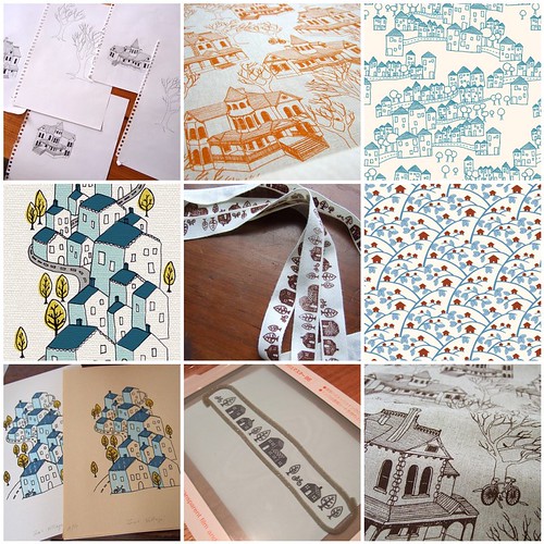
Anyway, given it's my first proper weekend off in almost a month, I thought it about time to reacquaint myself with a distant friend - the pattern designer in me! My sketch books are filled with half baked ideas, and one concept I keep coming back to is houses. If you've been reading this blog for a long time you'd be familiar with my obsession with houses...

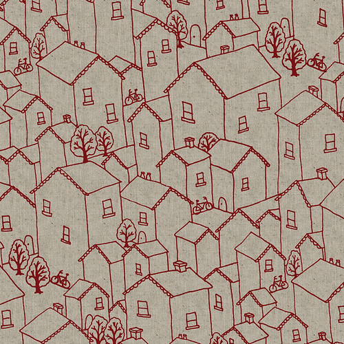
But I've never been able to come up with the perfect houses print for my textile range. I've had this vague idea in my mind for ages but have never been able to execute it. Until now. I'm really happy with how this has come together, and I hope you'll like it too...

Houses print... as yet unnamed...

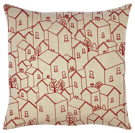
Cushion mockup - not sure of scale...
Anyway I'd love to hear your thoughts. I'm quite open to feedback. I've been thinking about it for so long that I've probably lost perspective...

43 comments:
I like the new design. I'm drawn to the rooftops, I like how they seem to fall into one another as my eye tumbles down the print.
Though my embroidery is shockingly bad, I want to go in with a bit of perle floss and fill lines and shingles and texture on those roofs. I like the scale you've picked for the cushions. Even before I saw your cushion picture, I pictured it just about that size!
This is really gorgeous! Not too fussy. I love the bikes. I like the colour, but think it would look good in an olive green as well.
Or how about olive green trees, if it's not too much trouble!?
I was lucky enough to meet you at the show in Brisvegas where I bought 2mtre of your bonsai fabric in natural. I'm actually am sewing a overnight bag & toiletry bag with it now, & it's lovely to sew with. I even bought the Meet Me at Mike's book, & got you to sign for me, so I was quite happy! Thanks for that!
Know that song about houses.. how does it go?...
"Little boxes,
on the hillside,
little boxes,
made of ticky-tacky,
Little boxes,
on the hillside,
Little boxes, all the same.
There are pink ones,
and some green ones,
there are red ones,
and some yellow boxes,..
[peaters out owing to lack of confidence in the lyrics...]
Anyhoo, sharing your not-quite-sick-admiration for houses, I am delighted at the theme.
Your test-print looks great - maybe a cat or dog somewhere?
Toodles,
~Soj
wow.. awesome..
i really love the pattern u've made...
how u print it?
i really excited with this one..
so i can do this in indonesia..
hohoho :))
I really like it too, I like the chimneys and the trees. Was good to say hi at the Brisbane show :)
That's gorgeous...love your fabrics but this is my new favourite...Would love it reversed in charcoal with white lines
The new design is great. I really like it's simplicity, quite japanese. I can't wait to see it in other colourways.
Congratulations on your success at the shows.
Love it! The scalloped edges on the pitched roofs are a beautiful detail and the bicycles are the perfect finishing touch!
These houses are great and it is nice to see the bike. Could one of the smaller roofs be coloured in or have some texture added maybe? I like Amy's idea of embroidering on it...
But seriously I know diddly squat about design.
Scale is good! and whoever said olive...yes!
Reminds me for some reason of Kensington Banks...the houses all cosied together like that...bikes and trees scattered here and there...would it be too corny to name it after yr hood tho?
I really like it.It reminds me of how I was brought up - with lots of family and friends nearby to look after each other. I think the bikes dotted around infer it's a happy neighbourhood. I love the colour too. And the scale. x x x
The art school grad in me can't help trying to analyse the significance of having the little bikes, but not roads or cars... some petrol-free Arcadia on a cushion? :P
Charming! Your Victorian homes print has long been a favorite of mine, so I'm glad to see you're continuing the theme. The openness and the fine lines create a nice balance. Not sure I would fill in the roof with pattern as it might make heavy spots when viewed from a distance ie: if the fabric was used in a large project. I quite like the scale you've chosen, too.
You nailed it! I think the scale is perfect. In fact when I saw the print I thought it would make perfect cushions for my living room and then I scrolled down a tiny bit more and walla! you made one!
Hi Lara! I like how the houses go every which way in your new print. It reminds me of M. C. Escher. Just a thought -- what if you made it more geometrical instead of hand-drawn? Glad to read Brisbane was a success!
I love your orange houses and trees print!
This is lovely - I would change a thing :o)
Monda
x
oops, I meant 'I WOULDN'T change a thing'. Doh!
Monda
x
Lara, I love the colour choice and I love the clever way the design seems to fit together like a jigsaw puzzle, nothing is out of place. Can there be a little "Where's Wally" person peeking out from behind a random wall/window? haha. Well done.
I was also thinking it would make a cool embroidery pattern too... simple straight lines. xo
Wow! That is quite an addiction :-)
I love the new design, although it's a bit busy for my personal taste. I wouldn't hesitate to use it in projects for gifts etc, though!
Glad you enjoyed Brissie. xx
It's so cute, it's like Houses & Bicycles little sibling. I like it.
LOVE.
fantastic work lara! thought i'd comment on both your blog and your flickr about how much i love your linework!!!
i think the print is very nice! :)
I absolutely love it!!
I want I want!
But I do love the second one along too, the orange one.
But I like this simplicity and that it could be more of a pattern as well as something "realistic"
xx
Loooove it! love it love it, i share your obsession with houses too i am just crazy about them, your sketches are soo cute and the print design is beutiful!!
This is so cute! I agree with some of the other comments that having it in a blue or green would be wonderful too. All I can think of is making a table cloth or tote bag out of this!
Love it! and all of the previous house prints above. I love that you can't really tell where it starts and where it ends. It seems like a town I could wander through for hours and never get bored.
Good luck!
I'm obsessed with houses too. I love your print! It reminds me a bit of the neighborhoods i lived in in Germany -- houses close together, lots of trees and bikes. Maybe you could name it "Nachbarschaft," or Neighborhood.
I think it's fabulous!
Lara, this is an amazing design. I'd love to see how it fits together as a repeat:)
i've been fascinated with houses for some time now too. i used to peruse the architecture and interior design sections at the bookstore. finally got myself a book on american homes (cuz that's where i'm from of course!). and i love seeing the wide array of architectural styles, from indian pueblos to colonial homes to victorian to art deco and minimalist styles. i'm seeing a whole lotta good house eye candy for future projects.
this print is a really nice one. i actually can picture fabric being made of the image on the upper right hand corner. I think that would be a fantastic follow-up on a future house series, perhaps? it would be really neat to have a small row of house-y printed cushions.... just a thought.
I love it... especially the little bicycle.
Absolutely love it...want to make that cushion!
I feel like I'm not adding anything new, but I love it too! The bikes definitely sent it over the edge for me. It went from adorable to buyitrightnow.
Thanks for the inspiration!
So exciting to see a new design! I'm in love with the little bicycles propped up against the houses. The design has a total European feel to it.
I agree it would be interesting to see reversed...dark back ground with light outlines.
I think it's great - you should definitely make it. I like the crowded feeling of the cottages.
Oh. My. Lordy. That there is a gorgeous print. Obviously that gem of an idea just needed to do a slow cooking stew-type thing. It's perfect.
I think that must be the perfect fabric - love the print, and the colour. It is now top of my wish list : )
Hi Lara! I just wanted to say that "tree houses" is one of my favourite patterns. Loved it when you first made it and still do!
Great print Lara- I love seeing the progression of your thoughts!
saat forex zayıflama hapları gizli kamera
Post a Comment