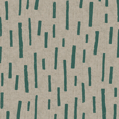
I'm really not very good when it comes to doing simple designs. I always feel like they should have
more, that there's not enough happening in them.
But I would like to do something simpler and a little more abstract, with a bit of texture. Really not sure, what do you think?


14 comments:
I like it! But out of curiosity, how big is it? A picture of the fabric with an object would help us get an idea of the scale of the lines. I do like the simplicity of it. I find it relaxing.
The green is ok, the white has real zing! Not sure why the difference, perhaps the contrast between ink and fabric colour? So yeah, love the white but like HappySquirrel, what's the scale?
Yes! I love the simple lines with a bit of texture added to them. Reminds of some of Alexander Girard's designs from the 60's. The green is a winner!
I like it! I think it could work in various combos. I like the blocks of colour with the texture. Keep going!
It's nice to have some that have a little less going on. This way if you want something with two fabrics that match, you can have one with pop and one that's more subtle, but still great.
I think it is yummy! I hope the scale is big!
-Rossie
I happen to be quite good at simple... it's the complicated that I struggle with! I like your lines, but suggest three things: make it more spare, vary the width of lines, that is make thinner ones, and finally try making the lines relate to eachother... like in lines, rows, paths... Just a few "what if's" for you to chew on!
I like it too, but agree with Jacqui. Even though it's difficult to discuss colors matters, I really prefer the white one, perhaps because the green is a little "dull" on that natural background ? Perhaps a yellower green would do ? Or one of your lovely blue or claret ? Something brighter, anyway ?
How great it must be to test a new design in your great workshop ! :)
i really like this. so simple but lovely. can imagine notebook and cushion covers. maybe even a scarf.
love the white (not a fan of green)
I'm so with you- I never know when to stop :-) I think this would be a great design for larger scale things, like cushions or lamp shades. I'm not so sure how it would work on the midgetty things I make- but then, I wasn't sold on the Rooftops at first, and now it's one of my favourite designs!!
love it! it's simple but still has depth because of the "irregularities". i think it will make for really pretty projects...
oooh, i love it! but i love both the white and the green. i find that the green especially showcases the lovely texture.
i have no problem with green.. but i'm finding that given the "grassy" likeness of the lines/sticks/whatever, and the almost literal dark green of natural real grass... it's not too appealing. maybe play with some different hues of green? not necessarily something that's super bright, but maybe find a dark green that is less literal and more fun? i'm sure it's out there! i definitely see the potential of this design and given simplyme's suggestions, i could almost see an entire collection just on lines/sticks! various shades of colors, various pattern design/layout, etc. have fun with the simple things!
Sometimes you just need a little texture. Would make a great accent print, yet works well on it's own. Has great movement.
Post a Comment