
And! Here's some scale options for you to look at. Any preferences?
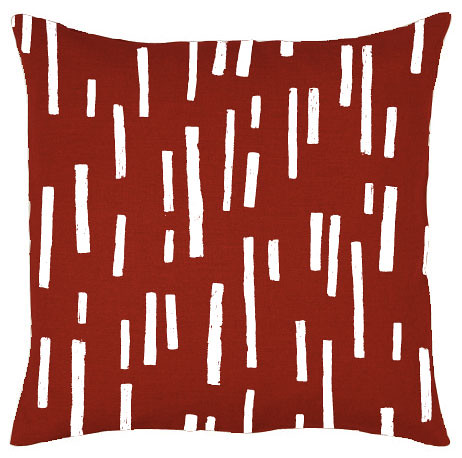
Rain/Dash/Chalk larger scale cushion mockup
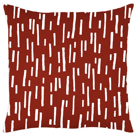
Rain/Dash/Chalk smaller scale cushion mockup
I'm also wondering what I should call this print. I think it reminds me of rain but also of chalk and also of dashes. Any suggestions?
Man how awesome would it be to dye some fabric red and print on it in white? Mmmmmmm, something for the future xx
32 comments:
I love it, and I think I like BIG scale better. Reminds me of wonky road markings.
Love the colour... I really like the top version, bolder:)
i love it too, and i think it should be bigger.
my brain is not thinking very creatively right now, so i have no ideas for names!
Agreed - like the larger scale one better! Would even fancy it ever so slightly smaller than the large mock-up, just to show off more of the pattern in something the size of a cushion. Looks lovely. Makes me think of roads and road trips.
I like both scales. I think if I had to choose, I'd take the more unpopular smaller version as a favorite- this pattern lends itself to smaller projects and might be more versatile that way. Easily can go both ways- both work great tho... toss up. They remind me of slots... but also bits of twigs.
I like the larger scale, also. It reminds me of those player piano rolls from long ago. Or the old computer punch cards - also from long ago. Both rather obscure, but that's what first came to my mind :)
I love the smaller scale version.. and I think 'chalk' is a great name for it :)
The larger scale one! The design reminds me of chalk and sticks =)
wow - this looks great! i like both of the sizes though. the larger scale would make an awesome skirt or really fun large pillows, and the smaller scale would work well for projects like wallets... sorry to be no help! sideways, this print looks like masonry or bricklaying to me.
as a cushion (you sorta limited our vision of the print by showing it off as a cushion..), the large scale looks much better to me too. it just doesn't seem like a small scale print. BUT, if someone were to make something smaller, then the small scale print would be fitting too. but as a cushion or other large object, i can't envision seeing the small scale pattern being utilized. just too distracting for me.
as for names, i'm loving it as french fries. it's lunch time and i'm hungry. but, i really love that someone mentioned the piano and computer cards. i wouldn't have thought of that, but very unique. i'd definitely stay away from calling it rain or something similar, otherwise we'd get it confused with your other similarly named patterns, if you catch my drift. it's easy to name something after nature if you've already got something similar; it's much harder to stick with something newer. if you want simplicity, though, chalk is just fine. i wouldn't even mind it being named chalk storm (like, hail storm or rain storm), or, if you must go with rain, maybe dancing rain or skittering rain? when people say rain, i keep thinking of that pattern with the rain drops in different colors....
love the white on red! definitely a must do for the future!
It looks like Chalk to me. Although the larger scale looks great on the cushion and would be lovely for something like a tote or laptop bag, I can really see this as a companion print to other (also bold) designs and so I think that the smaller scale would be more practical.
I like the smaller, but I guess it depends what you want it for. If I was to use it in say, curtains, I would prefer the big one. But for cushions I would prefer the small one. And to me, it reminds me of a forest (?!)
bigger is better :)
Love chalk as the name but only applies if the print is in white, otherwise I like dashes or the french fries idea. Can we see an even smaller scale version of the print?
It makes me think of the centre lines in the middle of the road. So 'how many roads'? (but I quite like 'chalk' too). And I think whoever came up with the pianola idea is pretty inspired as well.
I like both the scales, they'd be good for different things. Also like the contrast of the white on red. To me the pattern looks like grass, or stubble left over in a field.
I like the smaller scale. Could you perhaps print the smaller scale with red lines on white fabric and the larger scale one with white lines on red fabric? So the two fabrics could be used together?
I like the name chalk. It brings back all sorts of memories!
:)
I like the smaller version. It feels more active to me.
"chalk" is a good name. I like it.
It looks great!
I like the smaller version, because it's more flexible- I can use it to make small things (notebook covers, passport covers etc) but it also looks great on the bigger things like pillows. I think Sidewalk Chalk would be a great name- like a few others have said, it's very evocative of a lovely childhood!
I like the small version because most of my projects would be items such as wallets, pencil cases etc. Chalk is a great name.
love the bold, large format.
and perhaps a name along the lines of morse code? or coda? dashed. score. striate. or maybe a game of hangman! :)
reminds me of a lovely spring drizzle :) i adore this pattern!
I like the second one.. but both are nice. The name of Chalk is nice.
hello... hapi blogging... have a nice day! just visiting here....
Yes, it's great, esp. love the red & white combo with the darker colour behind - I like the bigger pattern. Looking terrific!
Like both ...
how about 'walk the line'
kind of risque and bold ;-)
i love the red colour!
the pattern reminds me of jazz music, much like the Michal Levy animation videos - have you seen them?
http://michalevy.com/one
http://michalevy.com/giantsteps_download
maybe the name can be rhythm-oriented!
I like the bigger version too. And I like the idea of the piano scrolls for a name. P x x x
Large scale appeals to me too!
Lovely abstracts Lara! For what it's worth I prefer the smaller scale one.
Your blog is soo cute & nice & very tasty!!
Regards from Agneta in Sweden
Very nice pattern. It makes me think of a traffic jam.
I like the smaller scale more.
Good luck!
bye bye,
Marieke
Post a Comment