In keeping with this new mission, today I'm going to share some photos and info about the two new prints that I designed recently: Blockprint and Watercolour Stripe.

Tools for making the Blockprint design
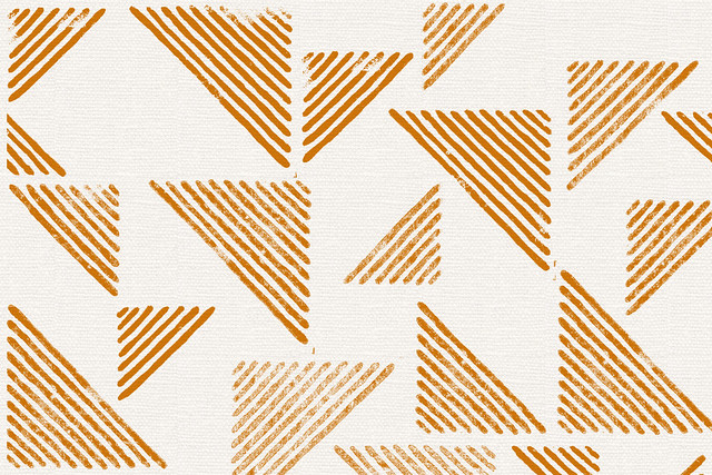
As Blockprint's name might suggest, this textile print started it's life as a block print! There was nothing particularly challenging about this lino cut, just simple lines. I wanted to do something quite different to my usual illustrative prints. Something a bit more simplistic and geometric.

Lino prints hanging up to dry
I did quite a few lino prints of this design, I wanted to get as much variation in the print quality as possible. So some solid prints, some patchy ones. I really love the texture of a patchy block print.

Blockprint mockup
Next I scanned all the prints into photoshop and separated them out into individual triangles. I think I ended up with about 12 different prints. I then took these prints into Illustrator and started arranging, rotating and cropping them until I was happy with the layout and felt it looked balanced. Also during this process I set up the design to work as a repeat, and prepare it for screen.

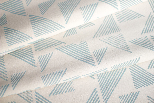
Blockprint as a textile print
After that it was just a simple matter of getting the artwork printed onto film and made into a screen, deciding on colours and then printing it in the studio. I like how imperfections translated onto fabric and retained that block printed look - yay!

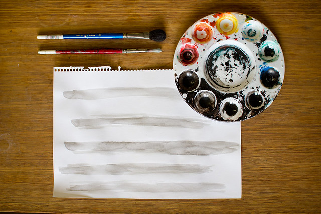
Watercolour Stripe in progress
As this name also might suggest (I'm never particularly adventurous with names) this design started off as an actual watercolour stripe! Really nothing fancy going on here, the hard work for this design was actually just getting to this point of simplicity. There was lots of playing around and experimenting with all sorts of complicated ideas before I realised that it needed to be quite simple.

Watercolour Stripe, digital processing
The next step was scanning the stripes into Photoshop and fiddling with contrast. I then played around with a halftone filter until I found the scale and texture I wanted. I like halftone filters but I prefer the square one to the dots. My aim here was to create a design that had interesting details when viewed up close, but when you looked at it from afar you could recognise the strips of watercolour.

Watercolour Stripe as a two colour textile print
It was fun to set this design up to work as a two colour print. The first colour is printed down the length of the fabric and then the second colour is printed with the same screen rotated 180 degrees.
So that's how those two prints were made! A far cry from back 4 years ago when my processes were purely digital and vector based. These were much more fun, and more sympathetic to the screen printing process I reckon.
xx

13 comments:
wow. Yes, it's amazing to see the process behind your designs, so inspiring. I love both of these.
I love seeing the process! very cool. I took a screen printing unit at uni and it was awesome ...lots of work involved. :)
Technology makes the whole process a lot less laborious these days doesn't it. I do like both designs, but especially the block printed one.
I love the detail in the watercolour print!
Wondering, can you recommend somewhere in Melbourne for getting large screens made up?
Thanks for sharing your process. I graduated from textile design in 1999 (purely hand drawn/painted/hand film creation). After the industry being saturated with vector graphics it's great to see technology being utilized to create more handmade graphics. I really love the watercolor stripe design.
How do you figure out the design repeat? And yeah, the process stuff is fun.
(okay, longtime reader, maybe never commented before. Hi!)
Nice printing design, Digital printing refers to methods of printing from a digital based image directly to a variety of media. It usually refers to professional printing where small run jobs from desktop publishing and other digital sources are printed using large format and/or high volume laser or ink-jet printers.
These are beautiful. It's great to see how it all comes together. You make it look so easy :)
Thanks for posting this...these are my favourite types of blog posts...I always forget about the possibility of scanning things to begin with to then mess around with digitally...gets the brain ticking :)
Dear Lara - This was such a great post! I love hearing about the How and not just see the result!! Anyhow, I would like to find out how you do to get the background of your scanned image to turn white as you begin working on it in the computer... Do you turn it into a bitmap, cut it out, or...? This is something I really struggle with as my scanned or photographed images always turn out to have gray backgrounds... Grateful for any help in this matter! Anna
Really love the faded texture look that the prints leave behind! I'm about to start my textile design course and this really excites me !
Thanks so much everyone!!
Anna, sorry for the slow reply! Sounds like you need to fiddle with the "levels" feature in Photoshop. You can use this to knock back the greys to white and make the blacks blacker. Then you can convert to a Bitmap once you've got this looking how you want it. Have a play around, it works great!
Lara.
Impressive! One of my favorite ways to use drawing for stress relief is to maintain a sketch diary. Keeping a sketchbook can be a form of journaling, and it can be cathartic, creative, and stress relieving.
Post a Comment