
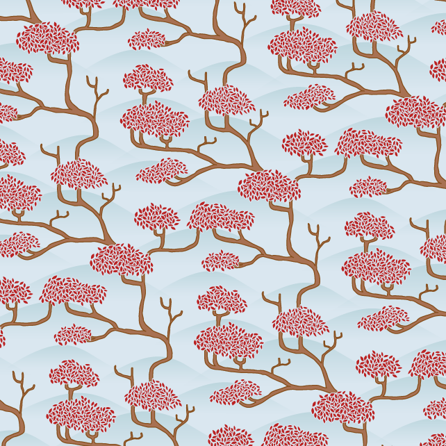
It's interesting how a pattern sometimes only looks good once you've got the colour combinations working just right. I tried this one in many other colour combos and it just wasn't working.
I'm thinking maybe it needs more going on in the background - some faded hills or something. Any suggestions?
Updated - added some gradiented blue hills in the background as Steve suggested!
1 comment:
a wisp of cloud on the left of each hill would/ could accentuate the lie of the branches or a river. Maybe a river running from right to left at the base of the hill could accentuate lines? Just a thought - although it might end up cluttering your great designs.
Post a Comment