Friday, August 24, 2012

Print and Process

The other day I was reflecting about this blog and how it's changed over the years. I realised that I miss the days when I used to have more time to document and explain my processes. I've fallen into that all too easy habit of posting only the finished product and stuff that happens at the end of the process. I know the stuff that goes on behind the scenes is probably more interesting to some people, so I need to make more effort to pause and take pictures.

In keeping with this new mission, today I'm going to share some photos and info about the two new prints that I designed recently: Blockprint and Watercolour Stripe.


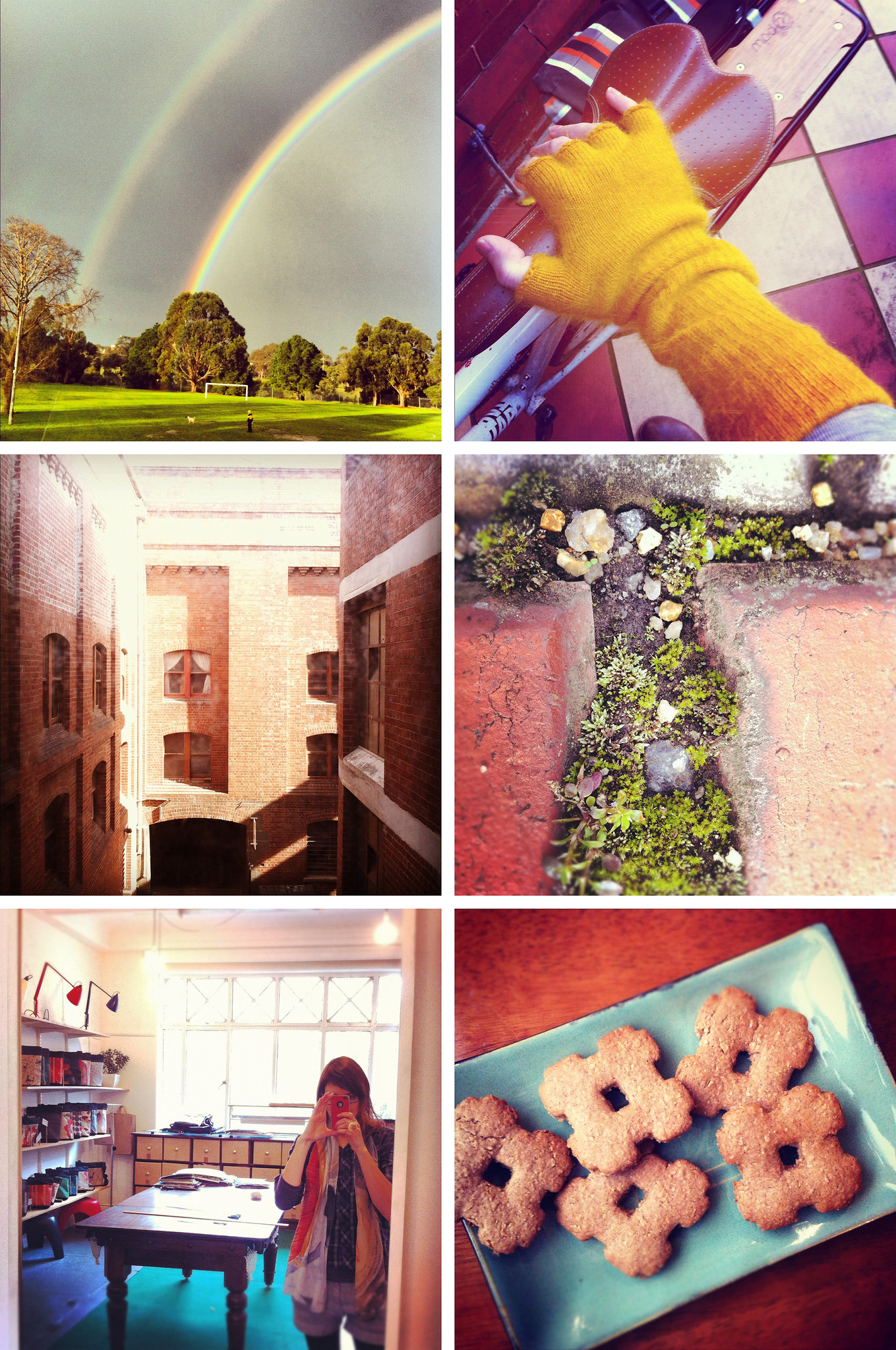
Tools for making the Blockprint design

As Blockprint's name might suggest, this textile print started it's life as a block print! There was nothing particularly challenging about this lino cut, just simple lines. I wanted to do something quite different to my usual illustrative prints. Something a bit more simplistic and geometric.


Lino prints hanging up to dry

I did quite a few lino prints of this design, I wanted to get as much variation in the print quality as possible. So some solid prints, some patchy ones. I really love the texture of a patchy block print.


Blockprint mockup

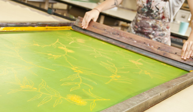
Next I scanned all the prints into photoshop and separated them out into individual triangles. I think I ended up with about 12 different prints. I then took these prints into Illustrator and started arranging, rotating and cropping them until I was happy with the layout and felt it looked balanced. Also during this process I set up the design to work as a repeat, and prepare it for screen.


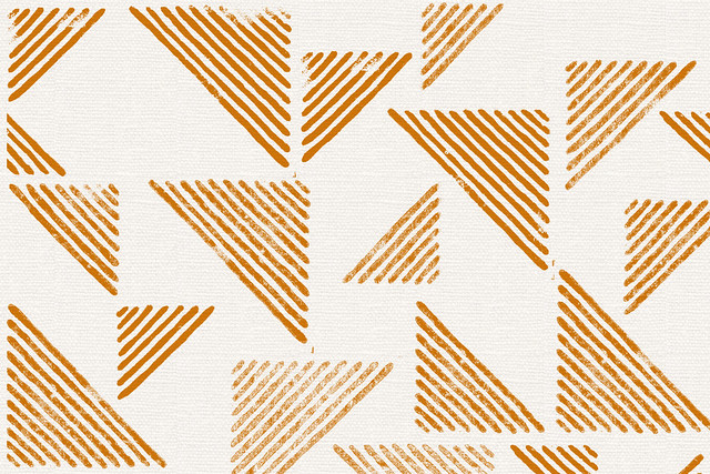
Blockprint as a textile print

After that it was just a simple matter of getting the artwork printed onto film and made into a screen, deciding on colours and then printing it in the studio. I like how imperfections translated onto fabric and retained that block printed look - yay!


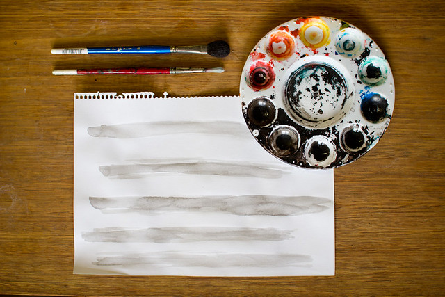
Watercolour Stripe in progress

As this name also might suggest (I'm never particularly adventurous with names) this design started off as an actual watercolour stripe! Really nothing fancy going on here, the hard work for this design was actually just getting to this point of simplicity. There was lots of playing around and experimenting with all sorts of complicated ideas before I realised that it needed to be quite simple.


Watercolour Stripe, digital processing

The next step was scanning the stripes into Photoshop and fiddling with contrast. I then played around with a halftone filter until I found the scale and texture I wanted. I like halftone filters but I prefer the square one to the dots. My aim here was to create a design that had interesting details when viewed up close, but when you looked at it from afar you could recognise the strips of watercolour.


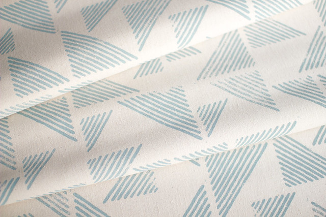
Watercolour Stripe as a two colour textile print

It was fun to set this design up to work as a two colour print. The first colour is printed down the length of the fabric and then the second colour is printed with the same screen rotated 180 degrees.

So that's how those two prints were made! A far cry from back 4 years ago when my processes were purely digital and vector based. These were much more fun, and more sympathetic to the screen printing process I reckon.

xx

Friday, August 17, 2012

Interior values

Doing what I do.

I've been sick for the last 10 days. I'm very bad at taking time off work but I've finally given in to the fact that I need to rest.

So I've been resting, and reflecting, and have come to a conclusion:

I'm starting to feel a bit jaded about interiors.

Once upon a time one of my favourite things to do was look at interior design blogs. Mostly as an observer but also partly as a participator, as I slowly worked on creating my own little space. But lately I've started to respond to what I'm seeing online with far less enthusiasm.

At first I thought that was to do with the fact that maybe I was losing passion for what I do. But that's not true. I still love my little business, I still love textiles and I still love creating things that end up in other people's homes. But I think what I'm sick of is the relentless competition, the relentless need to reinvent ourselves and keep up with what everyone else in the blogosphere is doing. It's hard to resist conforming sometimes when everything is triangles or geometrics or neon pink.

I've actually started to dislike house tours. Because instead of looking at photos of someone's home and thinking "wow, this place is just so full of memories and meaningful things" or "wow they've managed to make such a homely looking space without spending too much money" or "hey that's clever!" I look at these houses and think "fuck these people must have a shitload of money" or "wow that's very on trend... I wonder how it's going to hold up in 10 years."

I don't want someone to buy Ink & Spindle cushions to suit their currently-very-trendy-interiors-scheme, and then buy some new Ink & Spindle cushions to suit their new interior once they get sick of the old one. I want people to buy what we make because they are investing in something they are going to enjoy for years to come. Because it's special to them, because they appreciate the story behind it, where it was made, how it was made. Instead of an impulse buy I'd rather someone look at one of our designs for a year or two before finally splashing out on some meterage for curtains or a reclaimed and reupholstered chair.

I want what we make to be future proof. So I think I need to work harder to explain those values and maybe help people to shift their thinking and not get sucked into the vortex of current design. Hmmm...

xx

Thursday, August 16, 2012

Modern Times Pop-Up Shop

 
Modern Times Pop-up Shop with Ginkgo cushion (photo by Modern Times)

Just a quick note to let you know that the Modern Times Pop-up shop on Smith Street is having a relaunch party tonight from 6-8pm! All new furniture and artworks and other bits of local awesomeness.

I'm a bit excited because not only do they have some of our cushions in amongst all the gorgeous mid-century furniture and art, but they also have a set of my Proteaflora prints! It's the first time any sort of artwork of mine has appeared a wall somewhere for sale, so I'm pretty darn chuffed about that. I was actually working on the Proteaflora prints around the time of the first Modern Times launch party (a few months ago), and I remember daydreaming about them being a part of it and thinking maybe they'd fit in quite well. So it seems pretty fortuitious that my pipe dream came true in the end :)

xx

Friday, August 10, 2012

The fleeting

You know, I was thinking about what it is that I like about Instagram. Apart from the fact that it's a visual medium and I quite like taking photos, I love the fact that Instagram is all about celebrating the small and simple things. Fleeting moments that we stumble across in our daily lives that we feel are worth pausing and capturing.

You know how there's those cynical people who talk about certain social media saying: "oh that's just full of people telling you what they had for lunch today or some funny shit their kid said". Well you know what? Maybe that's a good thing. Life doesn't have to be full of momentous, hard hitting events. We're never going to be happy if all we're focussing on is the next big thing, the next big holiday or big purchase. I'm big on goals and always having something to work towards but I've realised that my tendency to always set the bar higher and higher means that there's never going to be that feeling of completeness at the end. Instead I've found that happiness needs to comes from enjoying the now, the myriad of minutia, the briefly beautiful, the fleetingly funny, the simple yet striking.


A full double rainbow stretches over Clifton Hill; bright and cheery gloves from Cottage Industry to warm my morning commute; sunshine on the bricks of our Younghusband Building; a miniature garden between the pavers; the beautiful Mattt studio whilst working on a new digital collab; "hash" cookies made by my sister in law (too funny).

 xx